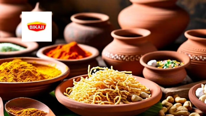
Bikaji Foods International Ltd has rolled out a refreshed brand logo as it looks to sharpen its visual identity while preparing for the next leg of growth in India and overseas markets. The update is positioned as a design-led exercise that balances the company’s legacy with its ambitions to appeal to a younger and more diverse consumer base.
The new logo draws inspiration from Bikaji’s origins in Rajasthan, incorporating a shield-like form that reflects strength and continuity. Design cues reference regional elements such as traditional headgear and the desert landscape, signalling authenticity while adopting a cleaner and more contemporary aesthetic. The company said the refreshed identity is intended to improve brand recognition across both physical retail shelves and digital platforms, where competition for consumer attention has intensified.
Deepak Agarwal, managing director of Bikaji Foods International Ltd, said the identity refresh mirrors the company’s broader focus on modernisation as it expands its footprint. He added that while the core values of the brand remain unchanged, the updated look better represents Bikaji’s scale, reach and evolving consumer profile.
The company clarified that the change is purely visual and does not involve any alteration to its legal name, ownership structure or contractual arrangements. Existing operations, partnerships and obligations remain unaffected.
Bikaji Foods is currently the third-largest ethnic snacks player in India, with a presence across 28 states and seven union territories. Its product portfolio spans bhujia, namkeen, sweets, papad, western-style snacks and ready-to-eat items. Beyond the domestic market, the company exports its products to more than 40 countries, catering to both the Indian diaspora and international consumers seeking traditional flavours.
The identity refresh comes at a time when established food brands are increasingly reworking their visual language to stay relevant amid changing consumption patterns and growing competition from regional and direct-to-consumer players. For Bikaji, the new logo is positioned as a bridge between its cultural roots and its future growth ambitions, as it continues to scale distribution, strengthen recall and deepen engagement with the next generation of consumers.


