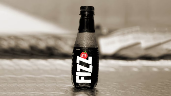
Parle Agro’s fruit-flavoured drink, Appy Fizz, has undergone a brand identity transformation, while retaining its original taste and flavour. The new design is fresher, re-imagined and bolder, taking the brand into a new era.
Inspired by its edgy, confident and vibrant personality, which has made it a hit among the youth since its inception, Appy Fizz has unveiled a new brand identity with a bolder and re-imagined look while keeping its taste and flavour unchanged. The brand’s iconic red, white, and black colours have been rearranged in a contemporary, eye-catching font for the logo. The fresh packaging of Appy Fizz aims to make a bold statement and stand out from the crowd.
Appy Fizz, a sparkling fruit-flavored drink, has made a mark in the beverage industry with its light, refreshing, and tangy taste, paving the way for a new category of beverages. Its innovative style and flavor have inspired many imitations over the past two decades, yet Appy Fizz remains the dominant player in the category with a 99% market share. Marketed as a healthier alternative to colas, Appy Fizz continues to amaze consumers with its lively and exuberant advertising campaigns.
Nadia Chauhan, Parle Agro’s Joint Managing Director & CMO, has highlighted Appy Fizz’s distinctive position as a beverage that makes a statement and maintains a unique identity. Although many similar drinks have been inspired by it, Appy Fizz’s exceptional innovation and quality have set it apart.
Parle Agro intends to mark Appy Fizz’s remarkable quality and introduce a revolutionary new appearance to the market of sparkling fruit-flavored drinks with the brand’s redesign, ushering in a new period of growth and disruption. The company aims to enhance the Appy Fizz experience even more and maintain its status as a top innovator in the industry.
The new packaging has been designed and conceptualized by Pentagram. Speaking on the new design Harry Pearce, Partner, Pentagram Design Ltd. said, “The essential idea for the Appy Fizz design was to modernize and to create a more visually arresting identity and bottle shape moving the brand away from the huge number of copycats. We re-addressed the emphasis giving the word ‘Appy’ equal prominence to ‘Fizz’ and employed a distinctive font with custom elements. The design retains the brand equity invested in black, white and red with a nod to the apple in the red dot.”


